(Not) everybody’s heard about the bird(s)
By Xanthe Vaughan Williams
T his post was triggered by the fact that we’ve been talking a lot about branding recently.
We frequently work with companies to help them find their voice through mergers, acquisitions or simply a change in direction, but when it comes to design we rely on the experts. If you’ve not seen it already, read our Q&A with designer and brand specialist Sarah Turner of The Value Engineers.
As we’ve been going since 2002, at which time we paid for proper printed headed paper and compliments slips, we thought it might be interesting to see how our own visual identity has changed.
For those who don’t already know, Fourth Day’s name relates to the “four calling birds” in the song The Twelve Days of Christmas. It wasn’t until 2013, however, that we felt brave enough to actually incorporate birds into our logo, although we used bird images to jazz up our proposals.
As a non-designer, I’ve summed up what we thought these brands represented for us. I’d welcome the views of those of you who actually know about brand imagery – you can join the conversation on LinkedIn here!

2008. Feeling quite grown up and prepared to risk a little more playfulness by giving the speech marks more of a balloon-y feel.

2008. Feeling quite grown up and prepared to risk a little more playfulness by giving the speech marks more of a balloon-y feel.
2009. Seven years under our belts and confident enough to have fun with all sorts of birds for everything from proposals to running shirts.
2013. Pre-adolescent and going with the zeitgeist. Twitter did already exist.

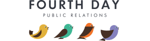
2018. Sleek and sophisticated. As we are now.
Share this: